What’s new
The IBM Design Language guidance, assets, and site experience are constantly evolving and improving. This page lists all major updates, changes, rollouts and release dates. Check back here to learn what’s new in the latest release.
IBM Plex® Sans Japanese
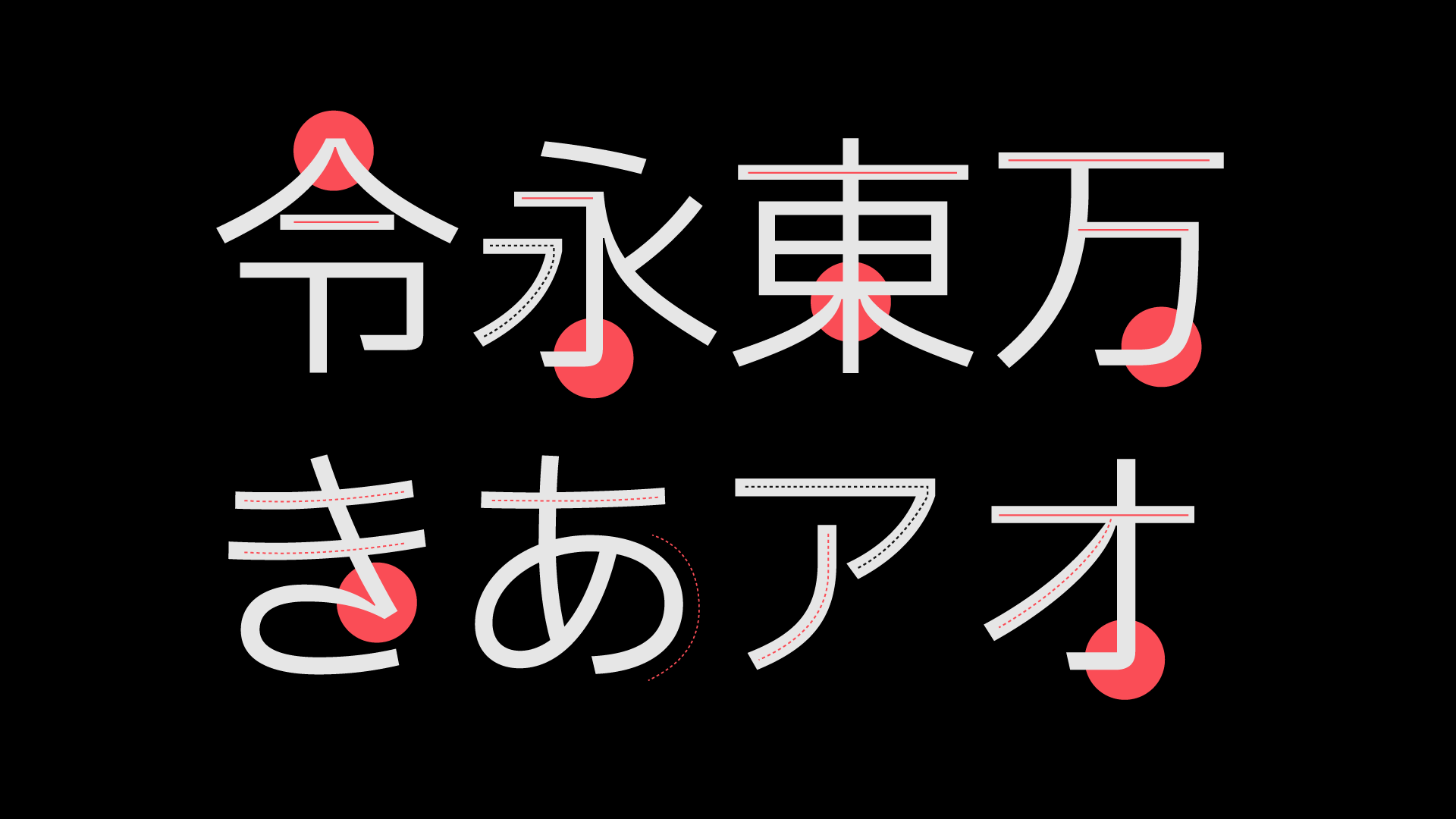
After two years of design and development, our custom-designed typeface, IBM Plex®, is now available in Japanese. IBM Plex Sans JP makes a fine addition to our non-Latin families and will continue to make IBM communications distinctive across all experiences in over 100 languages worldwide. Open source and free to use, Plex® also comes in Arabic, Cyrillic, Devanagari, Greek, Hebrew, Korean, and Thai. Learn more on how to use the Plex typeface family (w3id required) and download IBM Plex Sans JP here.
—
30 July, 2021
IBM and Red Hat Experience Guide

Our IBM and Red Hat Experience Guide is the singular source on how to maintain brand neutrality as you represent the Red Hat brand in IBM touchpoints. Discover how and when to approach co-branding for IBM and Red Hat. Detailed guidance for proper use of Red Hat brand elements is included, along with things to avoid. An updated terminology section provides definitions for commonly used terms and phrases at the intersection of IBM and Red Hat technologies. Examples and a gallery provide quick reference and inspiration for elements found in downloadable asset folders. We’ve included an FAQ section and contacts for your toughest questions in the IBM and Red Hat Experience Guide.
—
12 May, 2021
Expressive pictograms

IBM Design Language is a dynamic system that continually builds on the existing elements. Expressive pictograms are a natural evolution in our iconography portfolio. If you are looking for a different way to add bold graphic interest to your work, consider expressive pictograms. Based on our popular pictograms, these graphic elements pop with the considered application of color. Gradients are particularly striking on expressive pictograms as you convey brand-specific color palettes in your work. Learn about the differences between pictogram types, how pictogram strokes differ, and how to apply color to expressive pictograms on the IBM Design Language Pictograms Design page.
—
12 May, 2021
Imagery

Because imagery sets the overall impression of a brand, its impact can’t be underestimated. In a digital world, the window for capturing a user’s interest is very small. What they see and don’t see all have the power to elevate or diminish our brand. Learn about the IBM POV, including guidance on how to secure the photography, illustration or renderings you want for your next project, on the new IBM Brand Center Imagery page. Plan now to invest in our imagery because there’s nothing “stock” about IBM.
—
13 April, 2021
Illustration starter kits

Do you need to create illustrations? We’ve built Adobe Illustrator starter kits to help you accelerate your proficiency in building compelling, on-brand illustrations. In them you’ll find basics like grids, a primer on the underlying anatomy of each style and a foundational set of simple elements you can use alone or recombine to form your own new illustration narratives. Each kit includes an inspiration gallery of examples showing techniques. These examples aren’t a library of ready-made art; they’re solely provided to help inform your explorations. Use them to study and deconstruct the technical aspects of these versatile styles. Find the kits for line, flat or isometric style art here, and learn more about illustration at IBM.
—
09 February, 2021
Iconography contributions
The IBM Design Language now has over 500 pictograms and 1,000 UI icons available for download. Pictograms are used across IBM, from websites and events to merchandise and brochures. Our UI icons are specially sized for user interface applications, purposefully built into IBM products and web pages. Though pictograms and UI icons are small, they play a mighty role in embedding the IBM Design Language deep in our brand. We welcome designers who want to contribute to our libraries. Whether you have just one concept or a whole batch of new ideas, discover how to submit your artwork to our UI icons and Pictograms libraries.
—
22 October, 2020
App icons library
![]()
IBM app icons are expressive and distinct, visually communicating the core idea of a product or service in objective or abstract form. Across web platforms, product marketplaces and in native applications, these icons help users identify apps at a glance. To find out more about these important brand elements, visit our app icon library in the Iconography section of IBM Design Language. From there, you can find an overview of how to design app icons, plus guidance for app icon usage and production.
—
06 October, 2020
Logo requests
![]()
Our corporate identity is the IBM name and the IBM 8-bar logo. The way in which we apply both is a reflection of the IBM business strategy—to be a single, globally integrated enterprise. Wherever it appears, the IBM name and logo should always maintain and build the strength of the IBM brand. The logo request page can help you secure the proper approvals and images to protect our valuable logo asset. On it, logo downloads are available for IBMers and approved IBM suppliers who are required to adhere to certain terms and conditions to protect against misuse. An IBMid is required for downloads.
—
25 September, 2020
Animation guidance
At IBM, our forward progress is constant, and every move reflects the need to be
essential. When using animation, every element we set in motion is an extension
of our voice—it must serve a purpose, embody precision and communicate clearly.
We use several animation styles to serve a wide range of needs. Whether using
line, flat or isometric style, effective animation is simple yet concise and
engineered. See examples and guidance on the IBM Design Language
Animation
pages.
—
01 September, 2020
IBM Developer Experience Guide

The IBM Developer Experience Guide details how we work to build deeper
relationships with enterprise developers around the world. Written and designed
to reflect the brand promise statement—Build Smart. Build Secure.—the guide
exemplifies the clean, direct approach developers appreciate. Learn more about
how to express the advantage IBM developers have when building solutions using
our technology and resources. Find the
IBM Developer Experience Guide
under Brand Systems.
—
30 July, 2020
IBM Plex® Sans Korean

We are continuously working to extend the IBM Plex® typeface family
internationally. After over a year of development effort, we’re proud to release
IBM Plex Sans KR. This Korean language typeface is the first of our rigorous and
on-going Plex CJK project, which will include Chinese and Japanese, as well. IBM
Plex Sans KR is available in all eight weights and includes hinting for
optimized performance in digital environments. IBM Plex Sans KR is open source
and now available to download on
GitHub. To see how the typeface looks, play with it or any of the Plex scripts
using our Typetester tool on the
Typeface
page.
—
10 June, 2020
Illustration guidance

IBM builds systems and services to help our clients reduce and solve problems
every day. Our illustrations have a distinct purpose as well—to communicate
difficult concepts at a glance, in diverse and delightful ways. Nimble
illustrations help users understand complex ideas. They uphold the engineered
nature of the IBM brand through precise adherence to the grid, along with
consistent use of a system of angles, shapes and radii. Learn more about how we
use line, flat and isometric style to craft visual elements that extend our rich
visual history in
Illustration.
—
23 March, 2020
Data visualization guidance

Usable data is a central value IBM provides to our customers. Accurate,
understandable data visualization relies on clarity delivered through typography
using visual models that employ structure, contrast and rhythm. Consistency in
style and scale provides user confidence in the integrity of data. Context
maximizes the environmental constraints to enhance audience comprehension of the
data. Now the IBM Design Language provides a distinctive rationale for visual
representation of the IBM brand. Use this new guidance to create on-brand
data visualization
with impact.
—
23 March, 2020
Stationery system

The IBM stationery (IBMid Required)
system has been redesigned to be a modern statement of our brand expression. The
new business card is one universal size on your choice of blue or white card
stock and provides the flexibility to use multiple languages or social media
handles. The letterhead, envelopes and mailing labels are available in US and
ISO sizes with shipping envelopes. A phased rollout to markets worldwide begins
Q1 2020 and into 2021. Learn more and check the schedule for availability and
adhere to purchasing policies for your business unit and market.
—
13
February, 2020
Pictogram library

We have a new library with over 400 pictograms available to use and even more to
come in the next release. Along with the library comes an
.ai master file
with all the pictograms organized by category. This library and master file will
serve as the single source of truth representing the latest and approved
pictograms. If you need pictograms or want to contribute, please follow the
guidance outlines
here
and check out the
library.
—
9 October, 2019
Search and filtering

This cycle, we released a major enhancement to our
UI Icon and
Pictogram
libraries by adding search and category filtering, making it much easier to find
what you’re looking for!
—
9 October, 2019
Color palette V2

We’re pleased to announce the new IBM Design Language V2 color palette. The updates from V1 are quite subtle at first glance but incorporate significant refinements when considering contrast ratios and accessibility for digital screens and interfaces. For an in-depth article outlining the methodology and process please visit Because, colors are beautiful.
Updates
- 3:1 contrast ratio between 60/90
- 4.5:1 contrast ratio between 50/90, 40/80, 30/70, 20/60
- slight hue enhancements to the magentas to be more distinct from the reds
- hues across each color have been smoothed out for more consistency
- contrast ratios have been refined for a smoother curve
—
25 September, 2019